- A photo realistic style is used throughout the majority of information/reference titles.
- Information books usually tend to have brightly coloured and interesting cover pages, by having interestingly designed outer pages, it could draw in the audience's attention as the kids may be put off from reading it if they know that it is an information book. So by making the cover interesting and colourful, it makes it more welcoming.
- There are lots of illustrations present that are merged with text, the images usually back up or emphasise the wording on the page.
- The images are used to break up the text as it can be quite daunting, despite these books being for a much older audience.
- The large amount of text will put off a younger audience.
- Columns and grids are usually present in these types of books as there is more of a focus on structure of the book and the text in it.
- I think that the photorealism found in the images in information books is really important as they act as references so if they were abstract, it wouldn't be easy to link the images in the book with real life images.
- Elements:
- Real life/ photo-realistic images
- Bright colours
- Text present but it is backed up with images


Babies/ Toddlers- First Object Books:
- The pictures in these picture books are realistic as they are in theory references for the baby as they could link together the images in the picture book to real life objects. They would be able to notice and recognise the different objects in the book from the images to what they have seen in real life.
- Books which show the alphabet in upper-case and lower-case tend to be in cartoon format as the emphasis is on the alphabet letters (A, B, C) and not the images (Apple, Bird, Cat). These cartoons could be seen as being whimsical as they perhaps want children to use their imaginations more rather than having it laid down for them.
- There are no narrative to these first object books. The only wording present is the titles and the words underneath the objects which states what they are.
- I believe that this is an appropriate art style for children's first object books because the objects should be able to be recognised in real life as this acts as a learning aid.
- Elements:
- Photo realistic images in order to make recognition
- Bright Primary Colours


Picture Books- Aimed for 3-6 year old's:
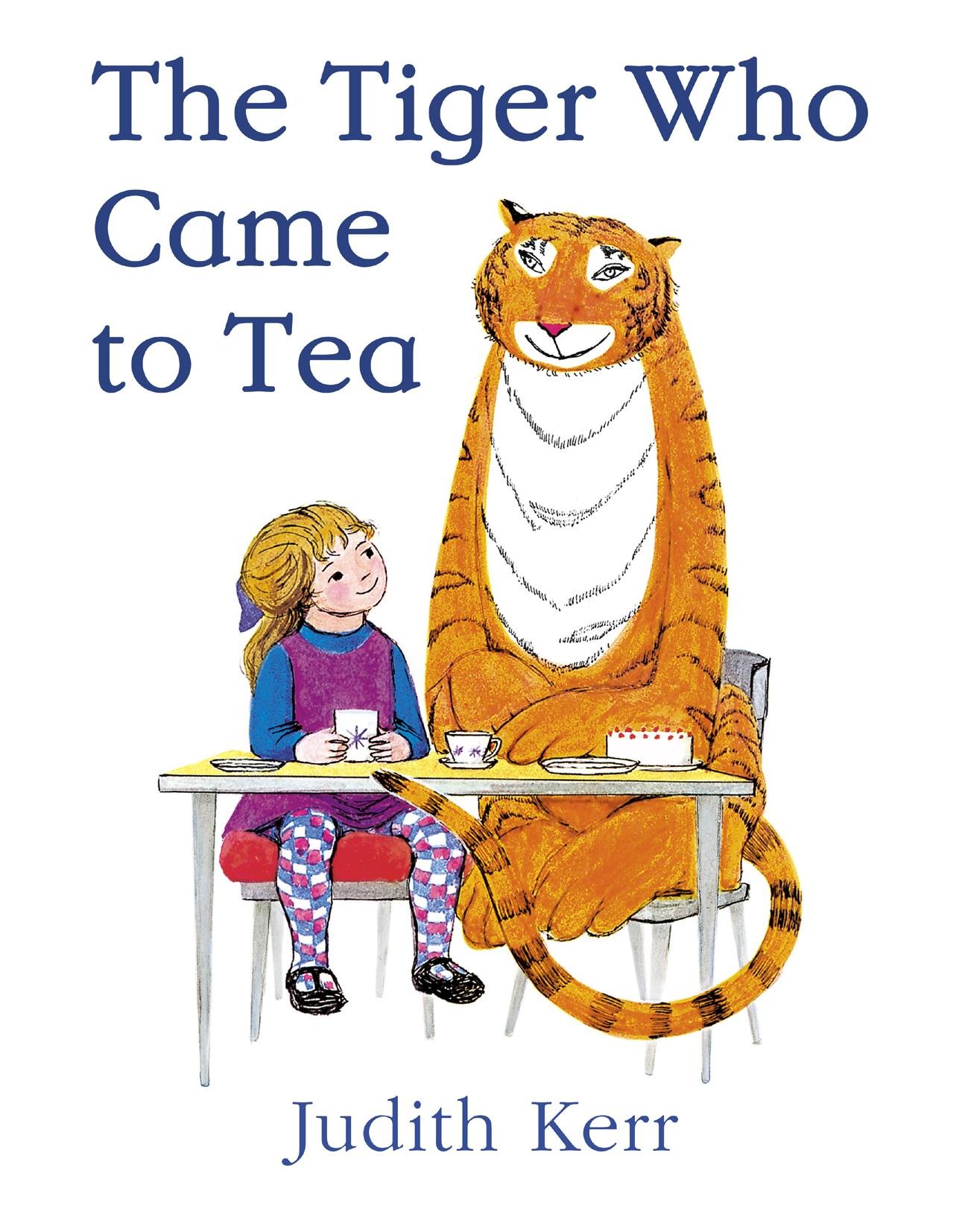
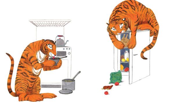
- There is a whimsical cartoon look to the majority of picture books as they are for small children with good imaginations.
- The main difference between picture books and first object books is the amount of text present.
- Picture books actually tell a story with both the text and the images.
- The wording is often illustrated so that its acts as an image in order for it not to be daunting for the children.
- There is very little, if any, examples of children's picture books with photo realistic images.
- I think that this art style is appropriate for this type of book/genre/age range to take more from cartoon images as they enhance the fact that it is actually a story and not real life. I think the fact that it is designed with cartoons acts as a type of detachment from real life.
- Elements:
- Lots of bright primary colours
- Wording is often used creatively to act like an illustration.

www.art-is-fun.com/art-styles/
No comments:
Post a Comment