Thursday, 10 March 2016

Outdoor Book Research

Below are examples that I found on Google Images of different examples of double page spreads of children's book in the information genre.

Columns and grids are used in every example and there is a specific background whether it is a shade of a colour or an image which relates to the topic in the double page spread. For a younger audience, the colour schemes usually are pastel colours or lighter, less harsh colours. For an older child audience, there are brighter and stronger colours such as oranges and greens. Blacks are also used for an older audience which aren't seen in the books for a younger child audience.

Pictures coming out of their boxes and overlapping is an important thing when it comes to book design as it gives the pages more depth to them.


In the mix of these images above, there are a mixture of double page spreads which are suitable for the younger audience which are 5-7 year olds and an older audience which is 7-11 year olds. I am going to take these examples and use them as inspiration and particularly use the grids and the columns in my work.

Sunday, 6 March 2016

Ideas

Idea One:

Bug Hotel Page (Double Page Spread):

Page one:
How to/method, What you need, Interesting facts about bugs found in England

Page Two:
- Cartoon style/drawings/illustrations on one half of the page
- The other half of the page would have a section where there will be a black and white (so the children can colour it in)/outlined version/take on the bug hotel with the instructions of the children drawing in the bugs that they have found using the above box with bugs found in England as a reference.


Idea Two:

Front Page:
- The background could feature bugs of all different shapes and sizes and different animals found in UK woodlands (the style would be cartoony- there is an example on my research blog post of this style)
- There would be a section on the front cover which will give the children an opportunity to write their names on the dotted line- From primary research (My Mom working as a primary school teacher), I have learned that children feel more attached to things they can write their names on as it becomes there's and is more personal to them.
- Another idea I had would be to print a personalised activity book for each child but then the price of printing and labour charge for someone changing names would be too much money.
- Personalised pages could still exist though, there could be dotted lines with the instruction of the child writing their name on the line or "Please Write Your Name Here".

E.g.     "...................'s Bug Hotel"


Idea Three:

- On the pages with the bushcraft activities/on a page afterwards, there could be an option for the child to stick in a photograph of the task completed or them completing the task.
- This would make the activity book more personalised and would be something the child could keep forever as a kind of journal and souvenir

Idea Four:

- Lined paper, Handwritten Font
- Black type and white/off white paper
- Small/large hand drawn illustrations.


Wednesday, 2 March 2016

Life Cycle Poster Analysis

Below are the two life cycle posters that I found, I chose two different poster styles but the same subject so that the analysis is more interesting as I am able to see the similarities and the differences.
There is a solid structure which takes its appearance as a circular format which shows the whole life cycle of a butterfly. As it is literally a cycle of life, it takes the format of a circular shape as it is the best way to show that it starts as an egg and ends as a butterfly. The same typeface is used throughout as is used in the heading. All of the small images are in circle shapes which I feel is suitable for the audience which would probably be for children or someone looking at the diagram for quick and basic knowledge of the life cycle of a butterfly.The main colour in this diagram is different shades of blue, the light blues feature in the background of the small circles which is like a blue sky. The flow of information is in the arrows which link the different sections together in a neat circle image. 


This example of the life cycle of a butterfly features a lot more words and information which means that it is more suitable for adults and older children which are looking for more information than just images. Despite there being more information, there isn't that many words, as the images are photographs rather than cartoon images which means that it is more likely to be correct in its information. The circular theme still stands with this example as it goes with the idea of the cycle of life. There is a blue colour scheme with this example as well apart from this one has a texture added to it which, in my opinion, looks more childish than the other example.

Session Task- How To Read A Book

Below are some initial sketches of concepts that I did for this short brief:


I decided to go with my "How to read a bed time story" idea as I thought it was the strongest concept and was the best idea out of my sketches. Below is the A4 version of my concept:


Grids

Grids are important and very useful with in graphic design as a whole. The grids give the document consistency as they all have the same look about them. There are many different examples of layout grids which can be used, below are some examples of the different types:


Although grid layouts seem very structured and plain, there are ways around it. Varying the different layout grids makes the pages interesting and intriguing to the audience. There are ways of coming out of the grid layout by using larger images/illustrations which gives it a new identity. Background images/colours/textures also set the layouts apart from each other.

Thursday, 25 February 2016

Initial Ideas

My initial ideas include:
- A map on the back page- the map would be simplified and only indicating the main sections of the park which the kids will need to go to. For instance, they wouldn't need to go to the university lecture rooms, hence why that wouldn't be on the map.


- From the options that we could choose from, I have an idea that I could have a page with how to make a bug hotel and on the opposite page of the double page spread, I would have a box/section with all of the bugs that they could possibly find in the woodlands and then underneath, there would be a empty box maybe with a black and white drawing of a bug garden with the instructions for the child to draw the bugs that they have found in the woods in the box.


Front Cover Idea:
My idea for the front cover and the name of the activity book is that it is called '100 Things To Do Outside'. It would include 100 activities for children to do outside. I am not sure as of yet what I would include on the front cover but in this diagram, I have included an outline of a woodland tree which would host greens and browns which I said were woodland colours.


Front Cover Idea:
This front cover idea would include a green background and it would host a box/section which would say 'This Book Belongs To.....'. The child would be able to fill in the section with their name meaning that the activity book would be a lot more personal to them which could mean that they would be more willing to take part in the activities if they are difficult.


Lakeside Brief- Initial Research

The main aim of this brief is to get children out into the woodland and experience wildlife and getting muddy again. This activity book needs to be informational but at the same time present the idea that being outdoors is actually still as fun as playing inside on games consoles. Bright colours should be used, in my opinion as it is for kids but I think that there needs to be a great deal of colours which relate to the woodland such as brown, greens, blues (for streams/lakes).

I am going to begin my research by looking at the following areas in children's book design:
- Outdoor books for children
- Outdoor Activity books for children
- Activity books for children
- Woodland themes
- Woodland themed books (children or adult)

Outdoor Books:


The above book covers and double page spread all have a theme, although they aren't actually activity books, they are all books which look at the outdoors, whether it is an information book or its a story book. As the activity book that we need to produce is for both boys and girls and also as a learning resource, it would need to be relatively neutral in the colour schemes. The above examples tend to swing one way or the other and aren't really suitable for both genders.

Outdoor Activity Books:

101 Things For Kids To Do Outside By Dawn IsaacRSPB 365 Outdoor Activities You Have to Try cover image
ISBN: 9780415729055 - The Outdoor Classroom in Practice, Ages 3-7


The book covers above tend to be all suitable for children and adults as the adults will probably be the ones helping the children to complete the different tasks.The front covers all have some kind of illustrations on them, whether it is cartoon style, photorealistic images or line drawings of cartoon and photorealistic images. It is a difficult one to decide on as kids like cartoon images and it makes them less daunting but if they are overly whimsical then they children may not see or understand the cartoon in relation to the real life object.

Activity Books (in general):


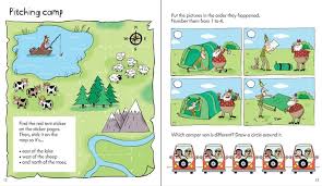
Above shows some images from the inside of activity books for children. I like the idea of having the map outline, I plan on incorporating that into my map which would be on the back page of my activity book.

Woodland Books (Adult and Children):


The above book covers range from being suitable for adults and for children, I wanted to look at a range of book covers for different aged audiences in order to see the different techniques that have been used.


3D Cutout/Print outs:


I have focused on bookmarks as I think this will also encourage the children to read more.


Other Inspiration: