Tuesday, 26 April 2016
Monday, 25 April 2016
Updated Computerised Designs
Below are the updated versions of my computerised designs after feedback from the user testing was taken into consideration.
Wednesday, 20 April 2016
Development Update: Artefact Page
After conducting user testing, I was given feedback which said that my artefact that is finger puppets isn't really suitable for a 7-11 year old age range as it is more for the younger age range. I took this on board and looked back into my research and my ideas previous to deciding on the finger puppets and I decided to work with origami as this is slightly more advanced for the other children. I did some initial sketches so I could see the layout ideas and then I took it to the next stage by developing it on the computer.
Below are my initial sketches and then the final outcome which is going to go into my final prototypes.
Prototype Development Stage
Below are my prototypes for this brief, I have all of the pages in this format, including the front and the back cover. There is still work to do with these prototypes from the feedback that I have and am going to receive, I also need to look into what is going on the back cover in the blurb section in more detail.
Tuesday, 19 April 2016
Sunday, 13 March 2016
Rough Sketches
Below are my rough coloured sketches.
Below are some better sketches which show more detail than the ones above.
This is the idea that I had for the front cover and back cover of my activity book, it would feature a band which would go around the book that would include the title in it and the blurb on the back cover. I wanted the covers to be looked at by children and think how they would like to be doing these activities, hence why the majority of the back and front cover will be filled with images. Below are some examples of potential colour schemes which could be used if I was to choose this front and back cover for my activity book.
This is an idea I had for the "Cooking with Fire" double page spread, I have used a grid layout in order to make the spread look structured and attractive. Below are some colour scheme ideas that would have to be thought about when it comes to a more in depth design.
This is the "Bug Hotel" page which I have renamed to be the "Mini Beast Mansion", there is a grid structure present in this design also. The boxes in the design would be made from a wood/bark/tree trunk texture which would be flattened slightly so that the wording and images would look good and would be visible on top of the pattern.
Below are some better sketches which show more detail than the ones above.
 |
| Wood/bark textured planks of wood with information on them. Detailed cartoons/real life diagrams of insects in the box with the cross in it. |
 |
| Wood grain/bark/tree trunk- realistic texture/cartoon texture. Notice board style- pinned to the tree. |
 |
| Ripped up paper with jottings down and stuck into the book using tape. Inspiration from Wreck My Journal. |
Nature Walk/ Bushcraft Research -Little Owl Farm Park
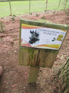
Below are some images that I took whilst visiting the Little Owl Farm Park, at the park they had a nature walk which had the aim to get more children into the idea of wildlife and the environment. Despite the graphics of the below images not being up to standard for this standard of work, the idea and the content is still very useful.
Subscribe to:
Comments (Atom)


